CIE A Level Maths: Probability & Statistics 1復習筆記1.3.1 Interpreting Data

Interpreting Data
You may be asked to comment on how statistics could affect data or how removing or adding a new piece of data could change statistics you have calculated. You may also be asked to compare two data sets of a similar context.
Analysing statistics calculated from a data set:
- You could be asked to use some statistics you have calculated, such as the median or interquartile range, to make decisions about the set of data you were analysing
- Writing about the mean or median gives information about where the data is located
- Writing about the range, interquartile range, standard deviation or variance gives information about how spread out the data is
- A lower value means the data set is more consistent
- A greater value means the data set is more spread out, or varied
- When commenting on a data set you should usually write about both a measure of location and a measure of spread
- You should pair the median with the range or interquartile range and the mean with the standard deviation or variance
- Use the mean and standard deviation/variance when the data is roughly symmetrical and does not contain outliers
- Use the median and interquartile range when the data contains outliers
- You should always write your analysis in the context of the data
- Sometimes a lower mean/median is better: time taken to complete a puzzle
- Sometimes a higher mean/median is better: score on a test
Changing a data set:
- Sometimes it might be discovered that a value was omitted from a data set and needs to be added in
- Similarly a data value could be found to be an error and will need to be removed (cleaned) from the data set
- It is important to be aware of how the?measures of location?and?spread?may change when the data is added or removed
- Adding or removing a data value to the set could change the mean, median and quartiles
- How each statistics changes will depend on where the data value lies within the data set
- Adding a data point below the mean, or removing one from above will cause the mean to decrease
- Adding a data point above the mean, or removing one from below will cause the mean to increase
- The median and quartiles may or may not change depending on the data value, you should always check these cases individually
- Adding or removing extreme values will change the value of the mean by a lot but affect the median in the same way as any other value
Comparing two data sets
- When comparing two data sets you must comment on both:
- A?measure of location?such as the mean, median or mode and
- A?measure of spread?such as the range, interquartile range, variance or standard deviation
- If you comment on the mean as the measure of location you should use the standard deviation or variance as the measure of spread
- If you comment on the median as the measure of location you should use the interquartile range as the measure of spread
- You should use information about the data to decide which measure of location and measure of spread is the best to use
- If data contains extreme values then it is best to use the median and interquartile range to compare the data sets
- Extreme values can cause the mean to be an unreliable statistic
- It is common to be asked to compare two data sets that are represented as two?box plots?on the same scale
- You should write about both the median and the interquartile range
- When writing a comparison about the data you should always write in?context
Worked Example
The diagram below shows a box plot of the average hopping speeds, in m s-1, of some Eastern Grey kangaroos living in an Australian nature reserve.
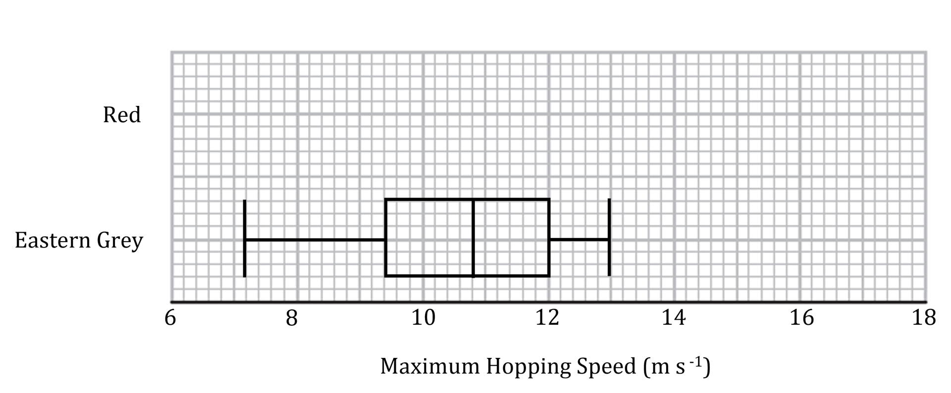
The maximum hopping speeds, in m s-1, of some Red Kangaroos living in the nature reserve are summarised below.
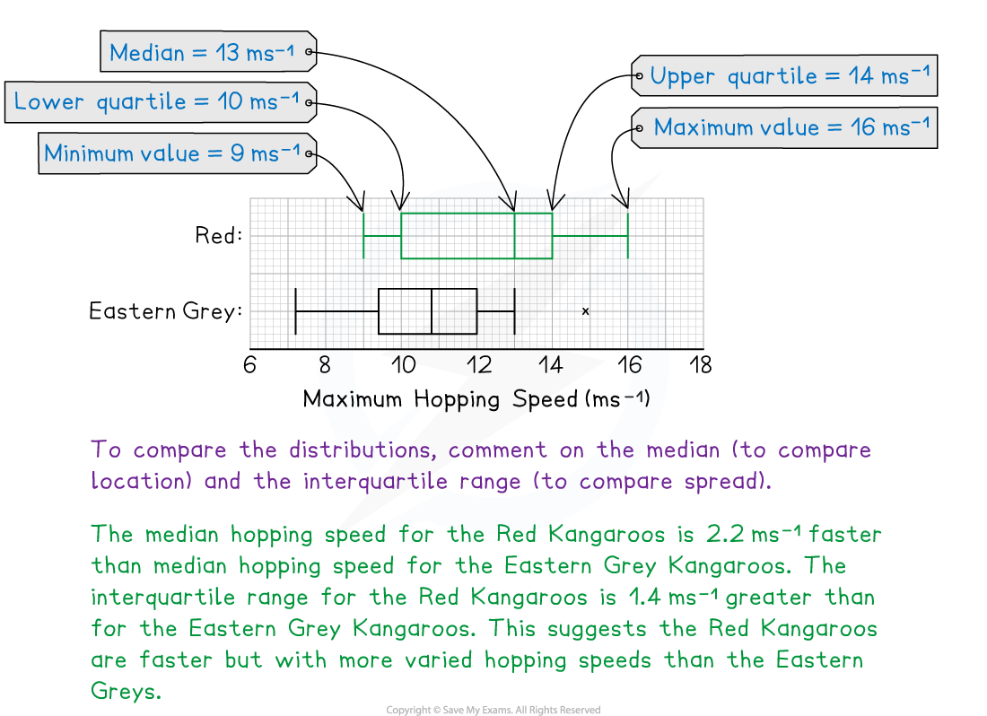
Lower quartile: 10??????????????? Median: 13???????????????? Upper quartile: 14
Minimum value: 9???????????????? Maximum value: 16
Draw a box plot on the grid to represent the data for the Red Kangaroos and compare the distribution of the hopping speeds for the Red and Eastern Grey kangaroos.
Exam Tip
- Remember to always write about data sets and their distributions in the context of the question. The number of marks available in comparison question are often an indication of how much you should say in the answer.
轉載自savemyexams
以上就是關于【CIE A Level Maths: Probability & Statistics 1復習筆記1.3.1 Interpreting Data】的解答,如需了解學校/賽事/課程動態,可至翰林教育官網獲取更多信息。
往期文章閱讀推薦:
2026 ALEVEL 夏考A率出爐!愛德思vs牛津AQA,哪些科目真的“好出分”?
2026 AMC10/12美國數學競賽新賽季!【翰林教育 × 清華大學出版社】獨家教材全面發售!


翰林AMC8視頻課重磅上線!

國際競賽真題資源免費領取