AQA A Level Biology復(fù)習(xí)筆記2.4.9 Water Potential Calibration Curves

Required Practical: Investing Water Potential Using Calibration Curves
- It is possible to investigate the effects of immersing plant tissue in?solutions of different water potentials?and then?use the results to estimate the water potential of the plant tissue?itself
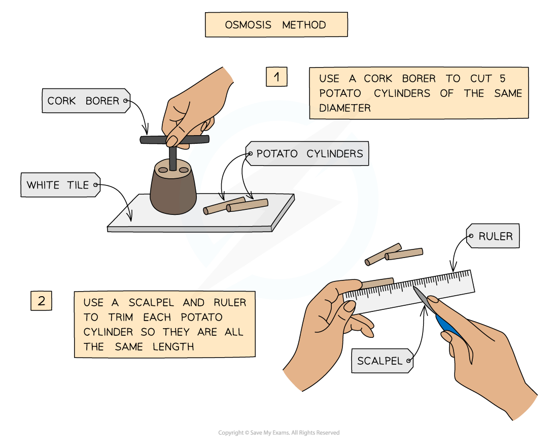
- The most common osmosis practical of this kind involves cutting?cylinders of potato?and placing them into solutions with a?range of different water potentials (usually sucrose solutions of increasing concentration?– at least 5 different concentrations are usually required)
Method
- The required number of potato cylinders are cut (one for each of the solutions you are testing – or more than one per solution if you require repeats)
- They are all cut to the?same length?and, once blotted dry to remove any excess moisture, their?initial mass is measured and recorded?before placing into the solutions
- They are left in the solutions for a set amount of time (eg. 30 minutes), usually in a water bath (set at around 30o)
- They are then removed and?dried to remove excess liquid
- The?final length and mass?of each potato cylinder is then measured and recorded
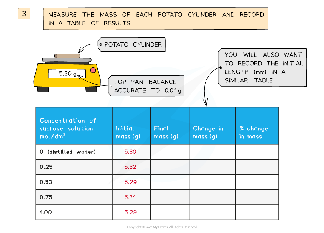
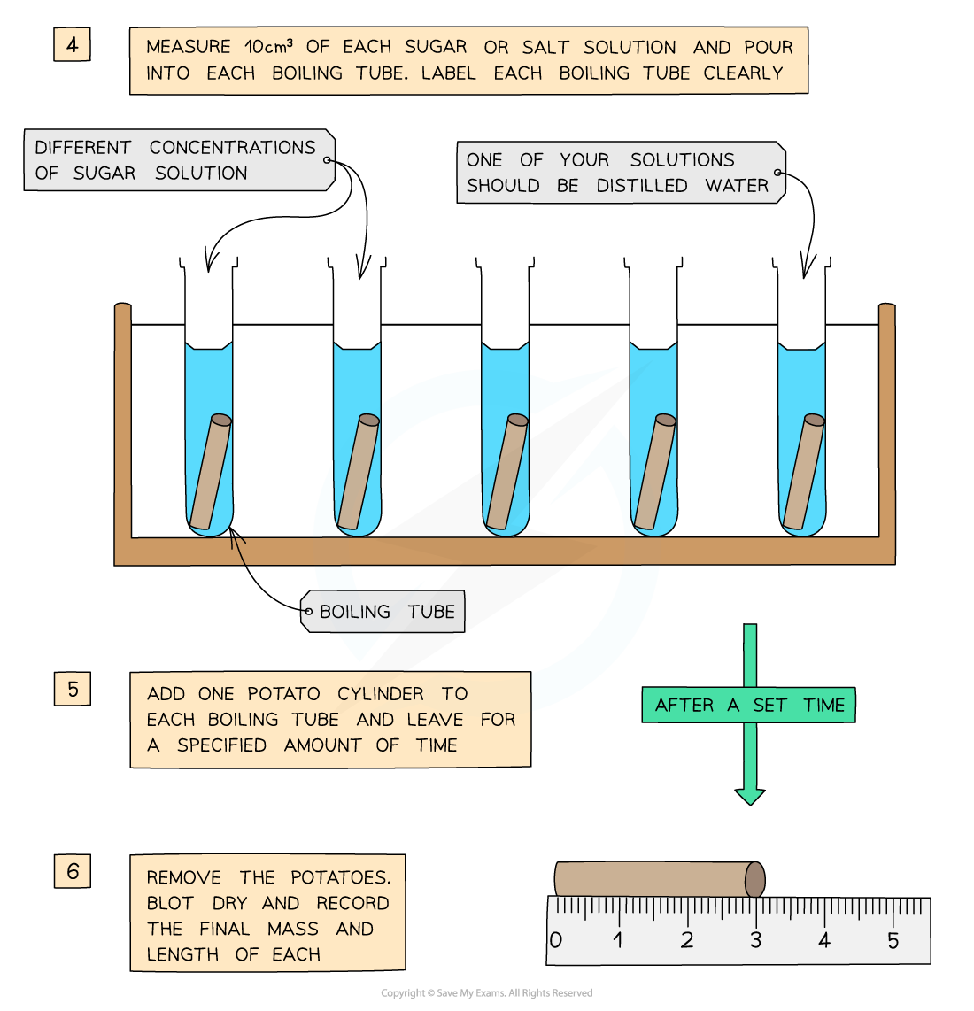
You will need to use apparatus appropriately to measure out the volumes of your solutions and record your measurements
Analysis
- The?percentage change?in mass for each potato cylinder is calculated
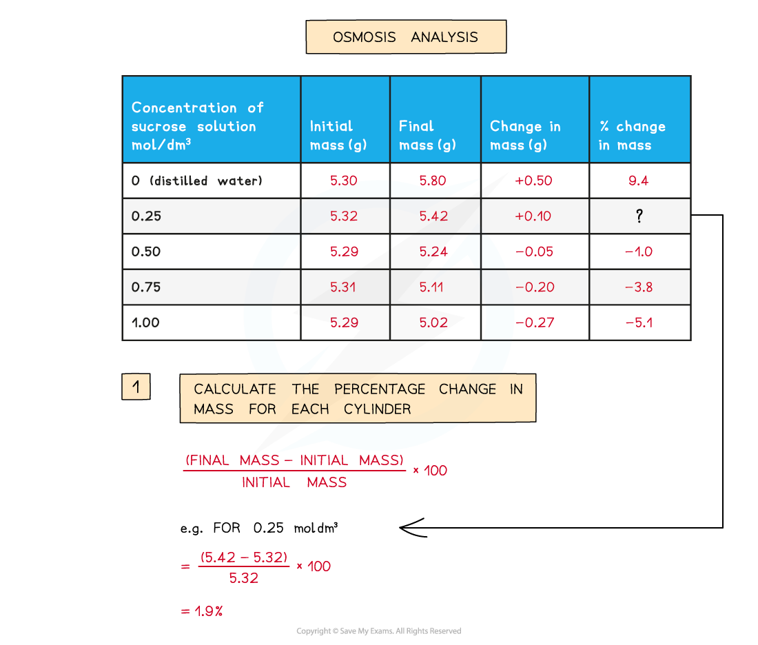
To find the percentage change in mass, the change in mass must be divided by the initial mass and then multiplied by 100
- A?positive?percentage change in mass indicates that the potato has gained water by osmosis (net movement of water from the solution into the potato) meaning the?solution?had a?higher water potential?than the potato
- This would make the potato cells?turgid,?as the water exerts turgor pressure (or hydrostatic pressure) on the cell walls – the potatoes will feel hard
- A?negative?percentage change suggests the opposite, that is, the solution had a?lower?water potential than the potato
- The potato cylinder in the?strongest sucrose concentration?will have?decreased in mass?the most as there is the?greatest concentration gradient?in this tube between the potato cells (higher water potential) and the sucrose solution (lower water potential)
- This means more water molecules will move out of the potato cells by?osmosis, making them?flaccid?and decreasing the mass of the potato cylinder – the potato cylinders will feel floppy
- If looked at underneath the microscope, cells from this potato cylinder might be?plasmolysed, meaning the cell membrane has pulled away from the cell wall
- If there is a potato cylinder that has neither increased nor decreased in mass, it means there was?no overall net movement of water?into or out of the potato cells
- This is because the solution that this particular potato cylinder was in had the?same water potential?as the solution found in the cytoplasm of the potato cells, so there was?no concentration gradient?and therefore no net movement of water into or out of the potato cells
Maths Skill: Graph Intercepts
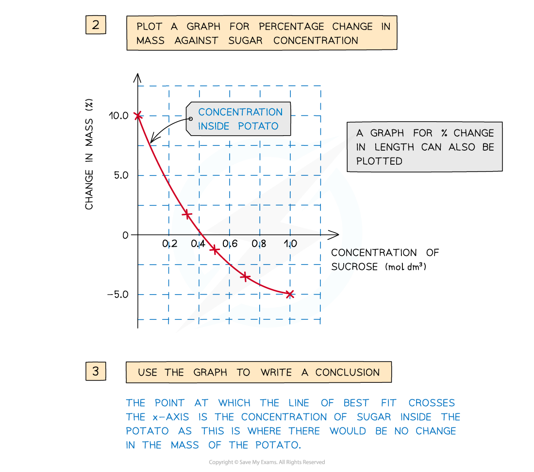
- The concentration of sucrose inside the potato cylinders can be found if a graph is drawn showing how the percentage change in mass changes with the concentration of sucrose solution –?the point at which the line of best fit crosses the x-axis is the concentration of sucrose inside the potato cylinders
A positive percentage change in mass indicates that the potato has gained water by osmosis (net movement of water from the solution into the potato) meaning the solution had a higher water potential than the potato. A negative percentage change suggests the opposite
Maths Skill: Plotting Data
- Plotting data from investigations in the?appropriate format?allows you to more clearly see the?relationship?between two variables
- This makes the?results?of experiments much easier to?interpret
- First, you need to consider what?type of data?you have:
- Qualitative?data (non-numerical?data e.g. blood group)
- Discrete?data (numerical?data that can only take?certain values?in a range e.g. shoe size)
- Continuous?data (numerical?data that can take?any value?in a range e.g. height or weight)
- For qualitative and discrete data,?bar charts?or?pie charts?are most suitable
- For continuous data,?line graphs?or?scatter graphs?are most suitable
- Scatter graphs are especially useful for showing how two variables are?correlated?(related to one another)
Tips for plotting data
- Whatever type of graph you use, remember the following:
- The data should be plotted with the?independent?variable on the?x-axis?and the?dependent?variable on the?y-axis
- Plot data points?accurately
- Use?appropriate?linear?scales?on axes
- Choose scales that enable?all?data points to be plotted?within?the?graph area
- Label axes, with?units?included
- Make graphs that?fill the space?the exam paper gives you
- Draw a?line of best fit. This may be?straight?or?curved?depending on the?trend?shown by the data. If the line of best fit is a curve make sure it is drawn?smoothly. A line of best-fit should have a?balance of data points?above and below the line
- In some cases, the line or curve of best fit should be drawn through the?origin?(but only if the data and trend allow it)
Exam Tip
Questions involving osmosis experiments are common and you should be able to use your knowledge of osmosis to explain the results obtained. Don’t worry if it is an experiment you haven’t done – simply figure out where the higher concentration of water molecules is – this is the solution with the higher water potential – and explain which way the molecules move due to the differences in water potential.When drawing graphs, students often make mistakes when choosing the scales for their graphs. If possible, you should try to avoid scales that involve using parts of grid squares on the graph paper and instead try and use whole grid squares, as this makes it much easier to plot data points accurately.
轉(zhuǎn)載自savemyexams

國際競賽真題資源免費領(lǐng)取


美高學(xué)分項目重磅來襲!立即了解